Empower your your brand with unmatched digital strategies
Unlock the full potential of your business with our tailored digital marketing strategies that turn data into growth. Perfect for SMEs, startups, and B2B companies aiming for measurable success.
Precision Targeting
Reach your ideal audience with laser-focused accuracy.
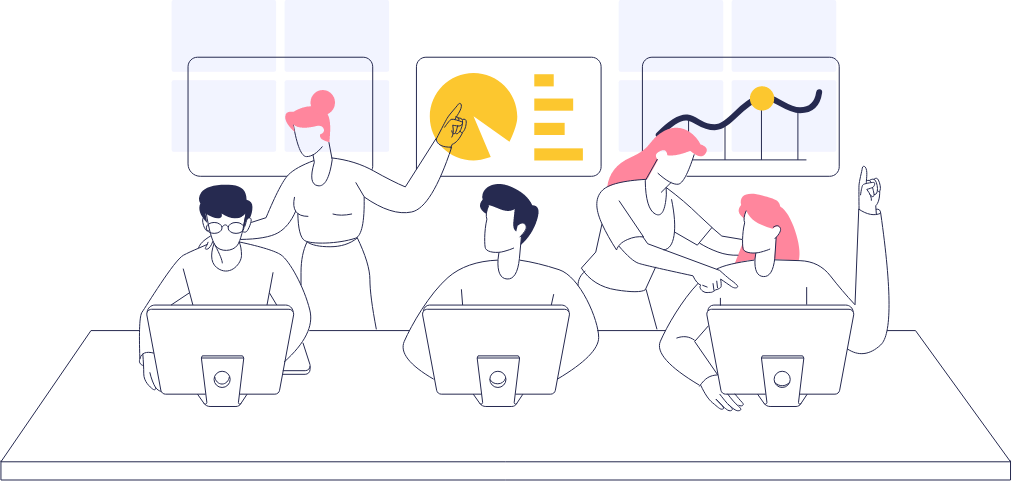
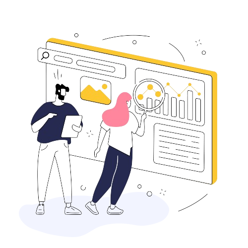
Insightful Analytics
Make informed decisions with comprehensive data analysis.
Sustainable Growth
Drive long-term success with strategies that evolve with your business.
Grow through the power of data
Tailored marketing plans that align with your unique business goals and challenges.
Deep Industry Insights: Utilize data analytics to understand market trends and customer behavior.
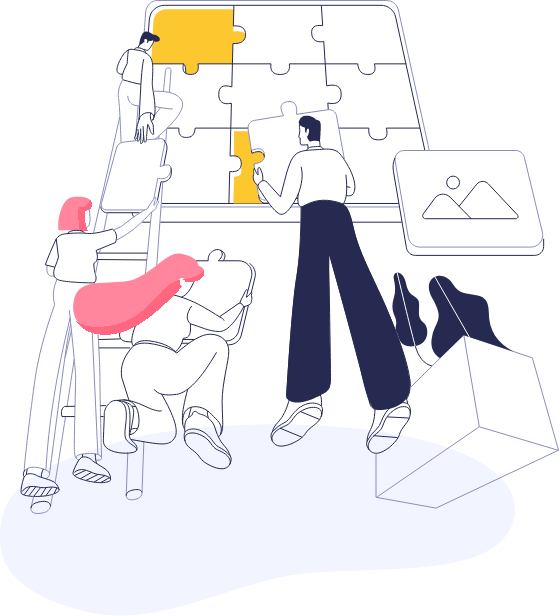
Strategic Planning: Develop a customized marketing strategy that targets your growth objectives.
Execution Excellence: Implement with precision for maximum impact and efficiency.
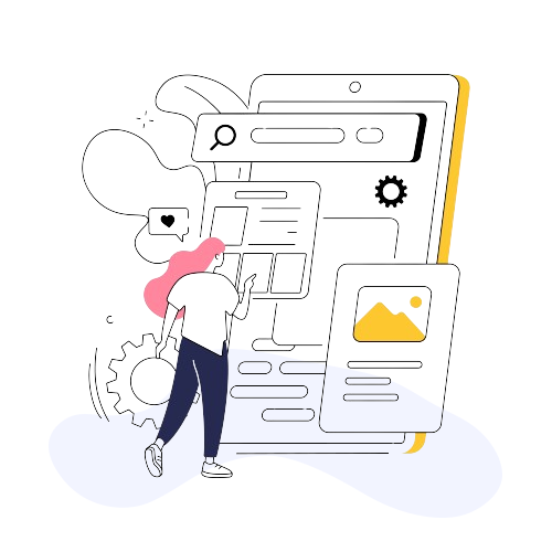
Create a lasting first impression with a website that combines aesthetics with functionality.
User-Centric Design: Craft websites that provide an intuitive and engaging user experience, encouraging longer visits and higher conversion rates.
Responsive and Fast: Ensure your site looks great and performs flawlessly on any device, reducing bounce rates and improving SEO rankings.
Custom Development: Tailor your website’s functionality to meet your unique business needs, enabling better service delivery and customer satisfaction.
A blend of SEO, content, social media, and PPC tailored to your needs.
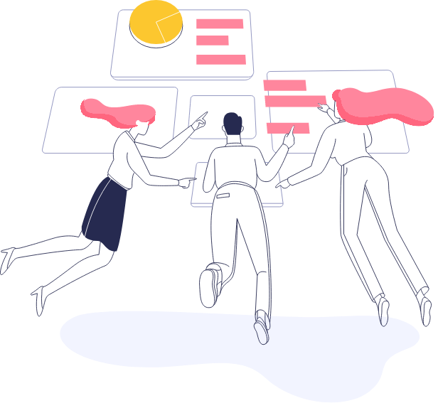
Continuous Optimization
Never settle, always improve with ongoing data analysis and strategy adjustments.
Our portfolio speaks volumes
Dive into our curated collection of transformative projects. Each piece is a testament to our strategic prowess, creative innovation, and the tangible growth we deliver to our clients.
"I am so pleased with this product. I wish I would have thought of it first. I would also like to say thank you to all your staff. It fits our needs perfectly."
Carly Davie
Ceo - Cliency
Start building your
brand with us
Free
Lorem ipsum dolor sit amet, consect adipiscing elit. Ut elit tellus


